Saturday, February 05, 2005
White Papers of the world unite. You have nothing to lose but your obsolete format.
Have you seen the manifestos at ChangeThis? The content is hit or miss, but the format is cool.
The brainchild of Seth Godin, the manifesto format is the first to be designed explicitly for reading on a monitor. Okay, I know there's HTML, but the pages run off the screen, and you're always scrolling. PowerPoint works for groups but not for the single reader; without narration, it lacks sufficient content to be understood. White papers and articles are usually 8 1/2 x 11 paper documents wrapped in Adobe Acrobat; they are up-and-down artifacts in a horizontal world.
Enter the manifesto. A manifeso looks like this:
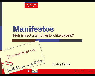
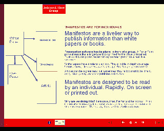
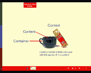
The thumbnails aren't from a ChangeThis manifesto. ChangeThis keeps its format to in-house, so I decided to make my own. Here's a sample. I plan to try this with a few white papers soon. Thoughts?
Have you seen the manifestos at ChangeThis? The content is hit or miss, but the format is cool.
The brainchild of Seth Godin, the manifesto format is the first to be designed explicitly for reading on a monitor. Okay, I know there's HTML, but the pages run off the screen, and you're always scrolling. PowerPoint works for groups but not for the single reader; without narration, it lacks sufficient content to be understood. White papers and articles are usually 8 1/2 x 11 paper documents wrapped in Adobe Acrobat; they are up-and-down artifacts in a horizontal world.
Enter the manifesto. A manifeso looks like this:


The thumbnails aren't from a ChangeThis manifesto. ChangeThis keeps its format to in-house, so I decided to make my own. Here's a sample. I plan to try this with a few white papers soon. Thoughts?


7 Comments:
Jay,
I like the new format and think it will work well for your white papers etc. I agree with you that we need to move past trying to replicate paper documents onine and start using the screen instead. In today's online world presentation is as important as content.
Good points, Jay. The PDF is limited, but a 2.4 MB PowerPoint (which I opened in openoffice.org) is fairly heavy too. Do you think that Breeze would be a better format? I've enjoyed some of your presentations in this format.
Personally, I think that a wiki would be best for a real manifesto, à la Cluetrain, but maybe that's too radical ;-)
Harold, you have an excellent point. I was going to wrap things in a pdf (which is what ChangeThis does) but I'm growing to detest Acrobat. Like fax, it seems to be swimming against the current.
I'll experiment with doing this in HTML although we all know the trade-off there -- losing control of the look. Maybe I can dream up a sufficiently tight format with CSS. Better still, perhaps a CSS afficianado like Zeldman would like to take this on.
Breeze is certainly another possibility. Since Breeze generates Flash, a template translator could do the job offline. I'll ping Tom King at Macromedia to get his take on things. My Flash skills are nil.
This seems like a job for Flash Paper.
http://www.macromedia.com/software/flashpaper/
Though even that is still a classic portrait-layout format by default. Might be interesting to forward this on to that team and find out what they think about horizontal or page-based scrolling as an available alternative.
Tom King
Absolutely pursue the HTML version. I saw one recently that was very much like this. Saved it to my computer - but I forget which computer. Now I have to hunt for it.
Here was my plan (still is my plan): create an XSLT framework with appropriate CSS to handle the page turner. Use a simple XML framework to define the content. Write a sinple content authoring tool to generate the XML.
To build this: maybe 20 hours work. 20 hours, sadly, which I don't have this month or next...
Flashpaper2 looks like the most viable way to accomplish this but unfortunately, the download from my Breeze account is brain-dead. Macromedia support won't talk to me because I don't have a Serial Number. I explained this was a comp account because I write about Macromedia and we use Breeze for Emergent Learning Forum. Ten minutes into this, the young lady told me where I could buy Flashpaper for $80. I'll pursue it because it looks like it may save a wispy 400 KB file.
Too bad Flashpaper is PC only. Good grief!
Post a Comment
<< Home